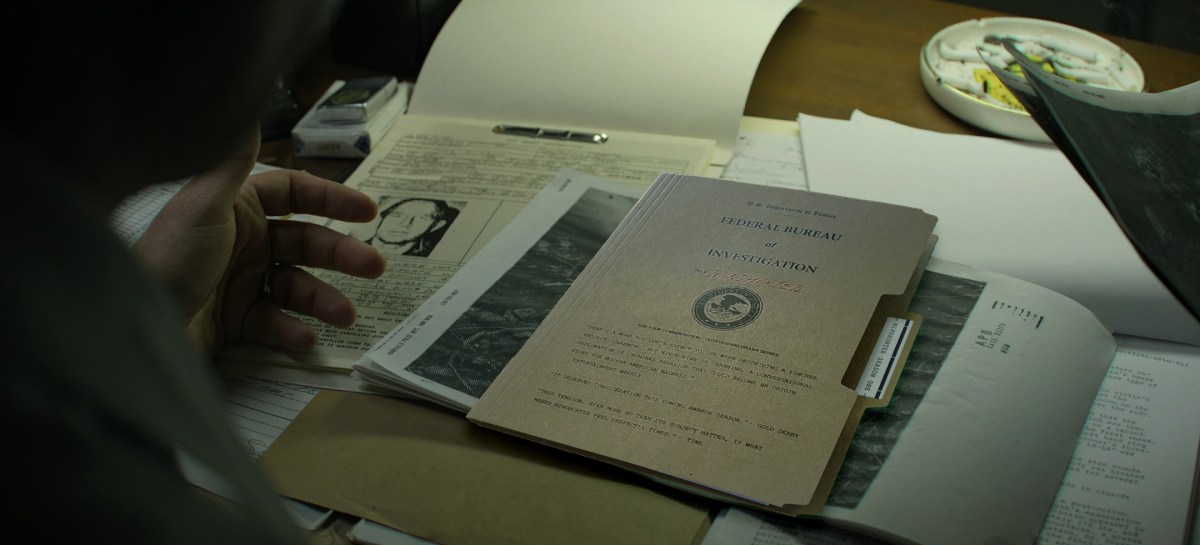
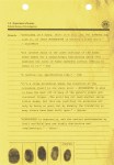
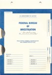
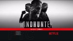
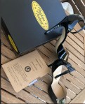
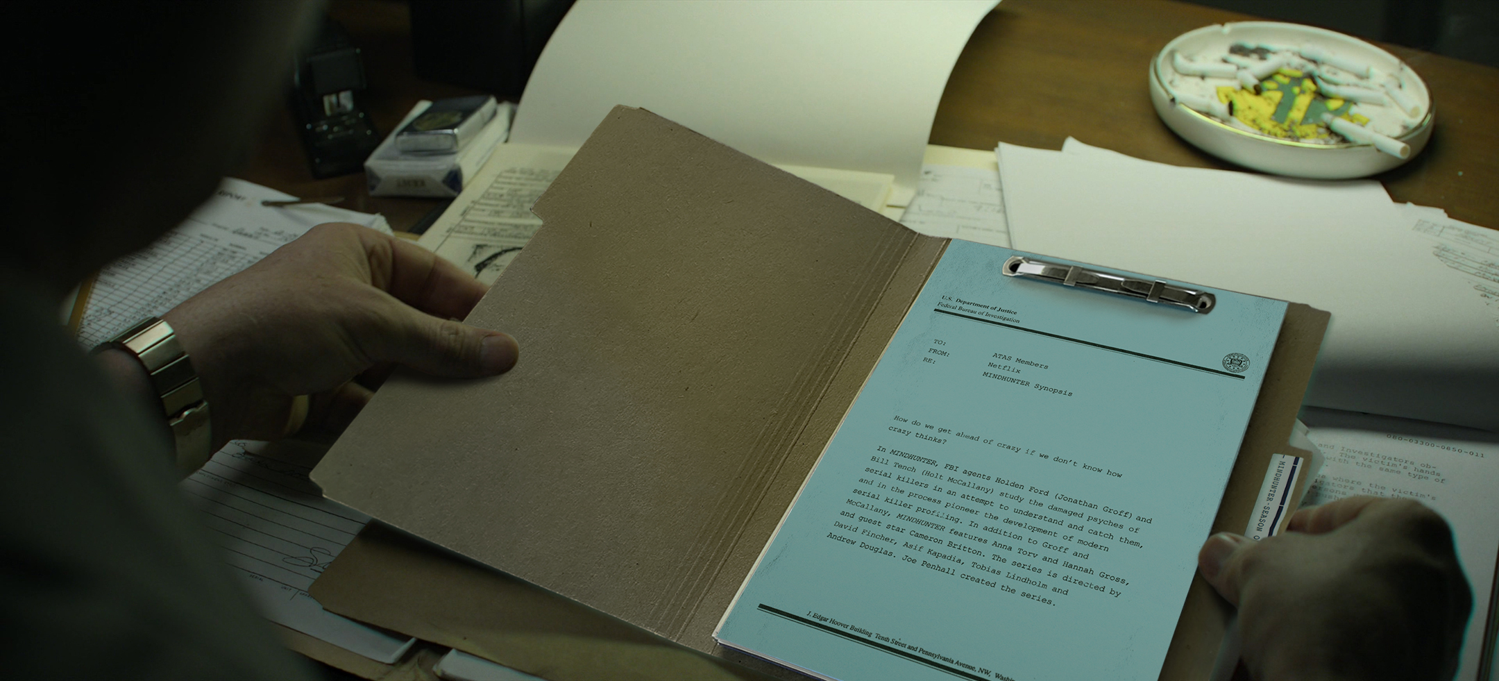
Here’s an in depth look at an extremely rare set of high heel shoes that were sent out to selected members of the Critics Choice Association to promote David Fincher‘s MINDHUNTER in preparation of the 2018 Emmy Awards.
Shoutout to The Fincher Analyst for their original post about these shoes and a huge Thank You to Chris Evangelista, who was kind enough to sell me his set! Be sure to visit slashfilm.com for more of Chris‘ amazing work!
And if anyone has more info on these shoes or happens to have a copy of the original letter from Netflix, then pleaseget in touch with me!
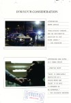
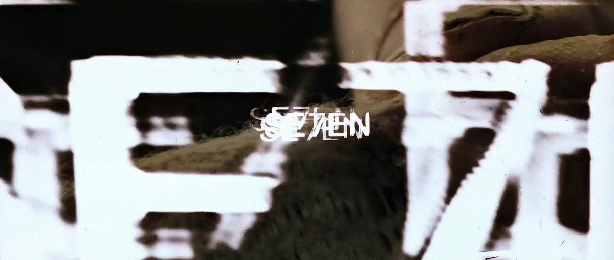
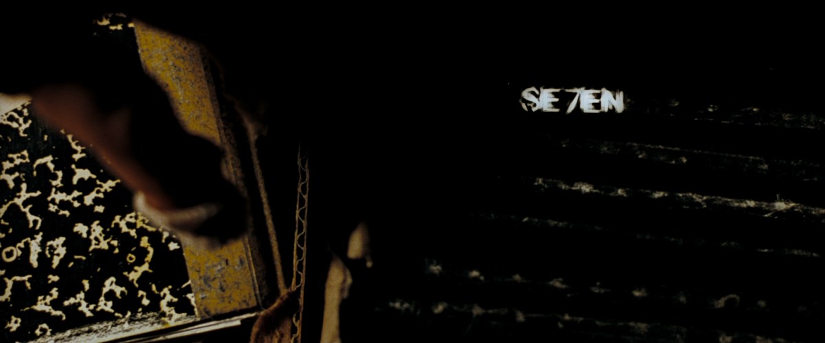
On September 22, 1995, David Fincher’s SE7EN introduced audiences to a darkness unlike anything seen before, accompanied by an opening title sequence from Kyle Cooper that has since become one of the most influential in film history.
For this classic title sequence, David Fincher tasked Kyle Cooper, founder of Prologue Films, to get inside the mind of a serial killer, immediately setting an ominous tone. Typography was scrawled into scratch board and shot on film, and Cooper shot tabletop photography representing the preparation of the killer’s obsessive sketchbooks. This dark yet spirited sequence was called a “masterpiece of dementia” and was credited with the resurgence of a generation’s interest in film title design.
The audio of this video is pulled from Kyle’s interview on the 2010 Blu-ray Special Edition of SE7EN, where he discussed the making of the sequence in detail.
In Part 1, Kyle reflects on his early conversations with Fincher. The two bounced ideas back and forth, shaping a vision that would forever change the way opening credits were made. This reel pairs finished titles with original process photographs, every frame shot on film, every prop (from John Doe’s notebooks to the hand model) photographed and tested.
“People think there’s computer graphics in there, but we assembled the majority of the sequence by hand… it takes on a life of its own.” In Part 2, he explains how he created the unsettling typography. Every letter was scratched, smeared, and distorted through the camera itself, analogue from start to finish. This reel pairs final frames from the title sequence with the original process photography of John Doe’s notebooks, props, and hands, showing how the haunting visuals took shape long before digital tools.
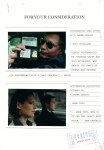
“This is John Doe’s job: he gets up, makes his books, plans his murders, drinks his tea.” In part 3, he reveals how the titles were designed to immerse viewers directly into the fractured psyche of the killer. To capture the killer’s mindset, Kyle went beyond typography. He gathered real objects from his surroundings, fish hooks, razor blades, sewing needles, twine, even clumps of hair from his shower drain, and filmed them in-camera alongside hand-crafted journals. These raw analogue elements were photographed, tested, and layered into the sequence, blurring the line between prop and pathology.
Kyle has recalled in interviews that during the premiere, when the title sequence finished, the audience actually clapped, something almost unheard of for opening credits. Thirty years later, that impact still reverberates across cinema and design.
The SE7EN End Credits Crawl
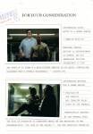
The unease of SE7EN doesn’t end with the final scene. Even the closing crawl was designed to keep audiences trapped in John Doe’s world.
Kyle and Kim Cooper crafted the end credits entirely by hand. Each name was cut out and taped together into a single, massive scroll, almost like a tapestry. The piece was then shot with a video camera and lit from behind so the light bled through the lettering.
To deepen the sense of obsession, the crawl was embellished with objects John Doe might have owned: razor blades, fishing hooks, twine, screws, wire, flies, even hair pulled from a shower drain. Every detail was assembled practically, frame by frame, just like the opening titles.
We first show the original handmade scroll, now preserved in five long backlit panels at Prologue Films. Continue watching to see the crawl as it appeared in 1995. Instead of rolling upward like a traditional credit sequence, Fincher had it roll downward, a subtle inversion that mirrored the sick, twisted psychology at the heart of the film.
SE7EN end credits crawl panel, displayed at Prologue Films, photographed by Hideo Kojima.
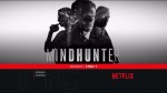
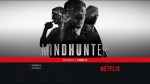
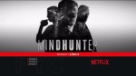
“I thoroughly enjoyed the visual sensibilities and filmmaking techniques used in the first season of Mindhunter on Netflix. Here are 5 of my favorite cinematography and film editing techniques that I feel made it a very distinctive show. Created and directed by David Fincher, he used many of the stylistic choices from his feature films such as dark cinematography and glass-like camera movement but also added some new tools to his arsenal as well.”
David Fincher’s work is full of fine details. You could conceivably watch his entire back catalogue without realising, for instance, that the camera tends to mimic the actors’ smallest movements. But during the editing process for his 2017 TV drama Mindhunter, he had an idea that nobody can have failed to notice. “I’m not sure which episode we were watching,” editor Tyler Nelson told the Art of the Cut website, “but he said, ‘Let’s fill the frame with a big location card.’”
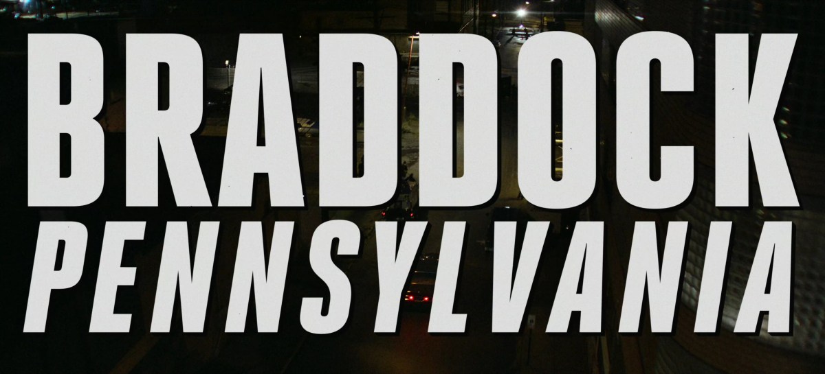
Whenever Jonathan Groff’s behavioural psychologist Holden Ford visits a new town, we’re told which one it is in massive letters that take up the whole screen: welcome to (eg) BOSTON, MASSACHUSETTS, and to a trend in TV and film for enormous location titles.
Mindhunter fans are split between loving its colossal captions and hating their overbearing presence, but they’ve caught on.
Fincher hasn’t just upped the stakes by making his location titles fill the entire screen, rather than merely a large proportion of it: the size of the text, combined with the chosen typeface (it’s Heroic Condensed, font fans) recalls tabloid newspaper headlines of the 1970s, when the show is set. It also evokes pulp/noir detective films from a few decades earlier.
A craftsman with a camera and an artist with a vision. Frank W Ockenfels 3 takes us through his detailed story of his close relationship with the late David Bowie. A master of light and one of the industry’s most prolific photographers, this is ‘Magic Hour.’
Click for a full screen view:
The Curious Case of Benjamin Button (Design by P+A / Mojo, Photography by Frank Ockenfels 3)
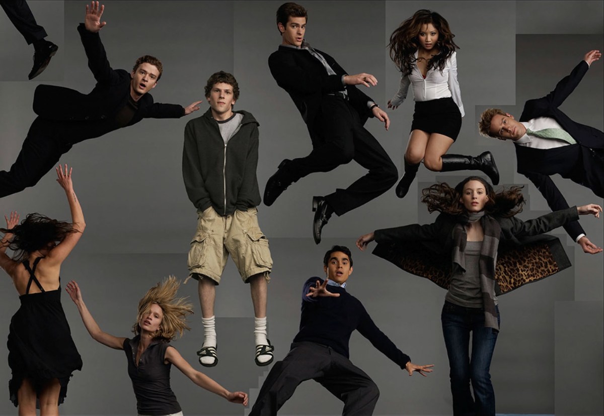
The Social Network (Design by Neil Kellerhouse, Photography by Frank Ockenfels 3)
The Social Network (Frank Ockenfels 3)
The Social Network (Design by Neil Kellerhouse, Photography by Frank Ockenfels 3)
The Social Network (Frank Ockenfels 3)
2011-02-09. The Hollywood Reporter (Photography by Frank Ockenfels 3)
2011-02-09. The Hollywood Reporter (Photography by Frank Ockenfels 3)
2011-02-09. The Hollywood Reporter (Photography by Frank Ockenfels 3)
2011-02-09. The Hollywood Reporter (Photography by Frank Ockenfels 3)
The serial killer film is nothing if not prolific: Robert Cettl discusses over six hundred examples in his annotated filmography, Richard Dyer argues that there are over two thousand serial killer films, and the IMDB lists more than 3500 film and television titles. [1] As with any genre, the serial killer film is marked by its typicality. Indeed, Philip Simpson criticises the serial killer film as a subgenre that is “endlessly derivative of its predecessors”. [2] The tropes of the clever, fiendish killer, his grotesque, ritualistic ‘signature’ and the gifted but damaged investigator are certainly familiar, but how does the serial killer film replicate itself on a textural level? This article will analyse the influence of Kyle Cooper’s much admired opening title sequence in Se7en (David Fincher, 1995). [3] However, rather than exploring the general influence of the sequence, I will focus on its stylistic similarities to the credit sequences of other serial killer texts such as The Bone Collector (Phillip Noyce, 1999), Red Dragon (Brett Rattner, 2002), Sanctimony (Uwe Boll, 2001), Taking Lives (D.J. Caruso, 2004) and the first season of Whitechapel (Ben Court and Caroline Ip, 2009). I will argue that their imitative or plagiaristic qualities can be interpreted in terms of Mark Seltzer’s work on the repetitive and circular discourse of serial killing.
Se7en
The title sequence of Se7en appears a few minutes into the film, occurring after a brusque initial encounter between Detectives William Somerset (Morgan Freeman) and David Mills (Brad Pitt) at the scene of the first murder. The sequence runs for just over two minutes and contains over a hundred shots, many in close up. It shows a person (whom we retroactively infer is the killer John Doe [Kevin Spacey]) shaving off the skin on his fingertips, and then working on a group of notebooks while wearing bandages. We see Doe writing in longhand, and highlighting and erasing portions of other texts. He also develops photographs and uses scissors to trim Polaroids and pieces of film. Doe incorporates some of these images and texts into the notebooks and then uses needle and thread to stitch the pages of his journal into a book, one of many.
The title sequence provides vital story material for the viewer about Doe’s activities. He removes his fingertips to ensure that he does not leave fingerprints behind, either in his apartment or at crime scenes. This also enables him to toy with the investigators by leaving a message composed of fingerprints on a wall at the second murder scene. Instead of this resulting in Doe’s apprehension, it points the police to his third victim, whose amputated arm was used to ‘write’ the words “help me”. After Doe surrenders, the police discover that he does not have a Social Security number, nor any banking or other official records. He is also, as Somerset states, “John Doe by choice”. His anonymity focuses police attention on to his mission or “work”. Indeed, during the final confrontation, Doe insists that he is not personally important, but that his crimes will be remembered and studied because of their shocking nature and diabolical logic (and Se7en is more memorable than many other serial killer films for precisely this reason).
Joe Fleming is a motion designer and animator based in New Orleans, LA. Originally from Omaha, NE, Joe has always had a passion for art and design. He developed his craft while studying Graphic Design at Loyola University in New Orleans. He fell in love with the city and its rich creative scene. While working with clients and colleagues from around the world, he is able to draw from their unique styles and techniques.
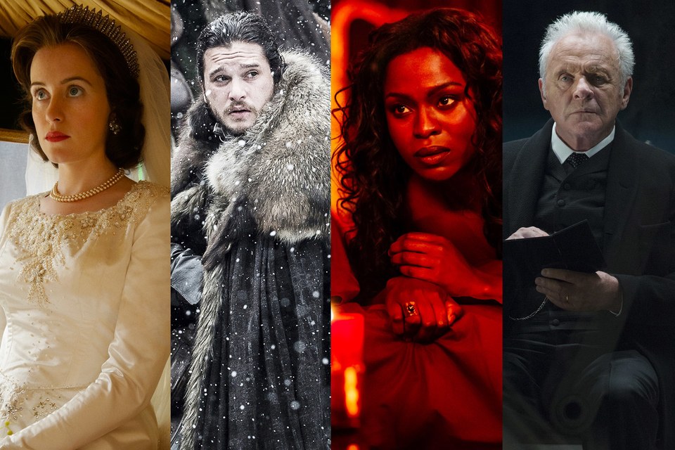
Along with shows including American Gods, The Defenders, True Detective, and more, they’ve all got gorgeous, elaborate opening credits designed by Elastic.
How do you set the tone for the sprawling world of Game of Thrones in just under 120 seconds? Ask Angus Wall. For the past six years, the designer—who created the HBO drama’s striking main-title sequence—has been devising new bits of opening animation for Thrones to coincide with the drama’s plot progression. Viewers know within the first two minutes of an episode whether they’re heading to Winterfell, King’s Landing, or beyond the Wall—where the night is truly dark and full of terrors. This year, the show’s plot has taken fans to new and long-absent locations including Dragonstone, Oldtown (where Sam studies to be a maester), and Eastwatch-by-the-Sea, which means the sequence itself has also had to evolve.


")