From Killing Eve to Mindhunter and Narcos, there’s a trend in TV for colossal captions. It’s a confident style choice that nods to noir fiction.
Jack Seale
October 26, 2018
The Guardian
David Fincher’s work is full of fine details. You could conceivably watch his entire back catalogue without realising, for instance, that the camera tends to mimic the actors’ smallest movements. But during the editing process for his 2017 TV drama Mindhunter, he had an idea that nobody can have failed to notice. “I’m not sure which episode we were watching,” editor Tyler Nelson told the Art of the Cut website, “but he said, ‘Let’s fill the frame with a big location card.’”
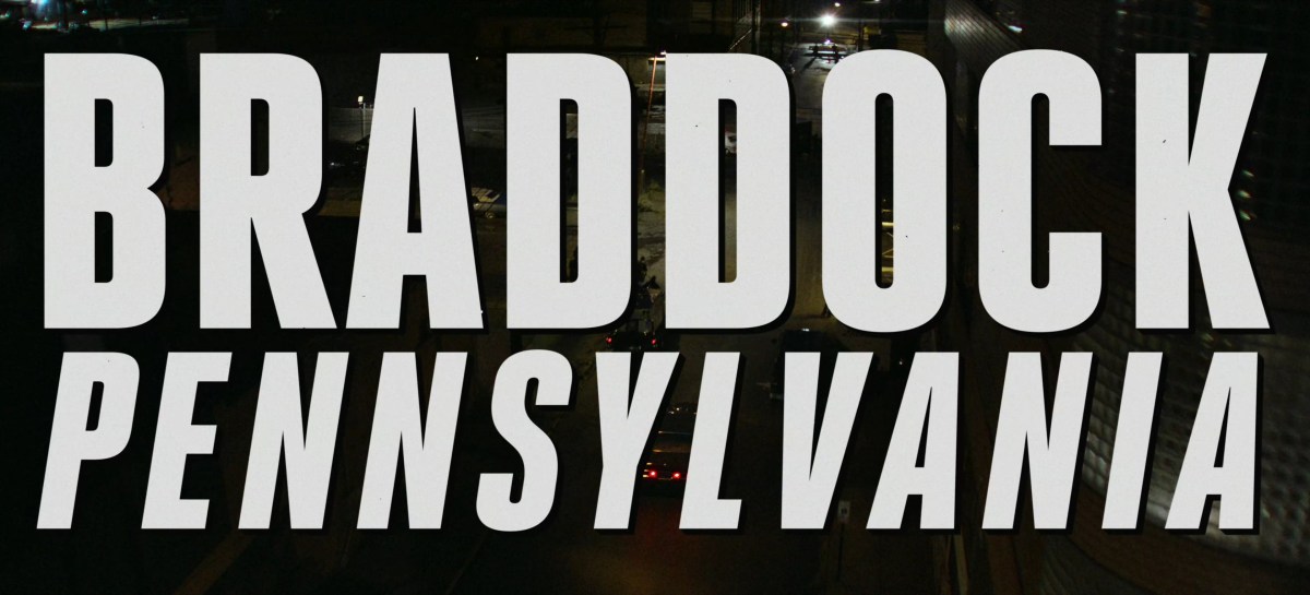
Whenever Jonathan Groff’s behavioural psychologist Holden Ford visits a new town, we’re told which one it is in massive letters that take up the whole screen: welcome to (eg) BOSTON, MASSACHUSETTS, and to a trend in TV and film for enormous location titles.
Mindhunter fans are split between loving its colossal captions and hating their overbearing presence, but they’ve caught on.
Fincher hasn’t just upped the stakes by making his location titles fill the entire screen, rather than merely a large proportion of it: the size of the text, combined with the chosen typeface (it’s Heroic Condensed, font fans) recalls tabloid newspaper headlines of the 1970s, when the show is set. It also evokes pulp/noir detective films from a few decades earlier.
