February 3, 2021
Anheuser-Busch
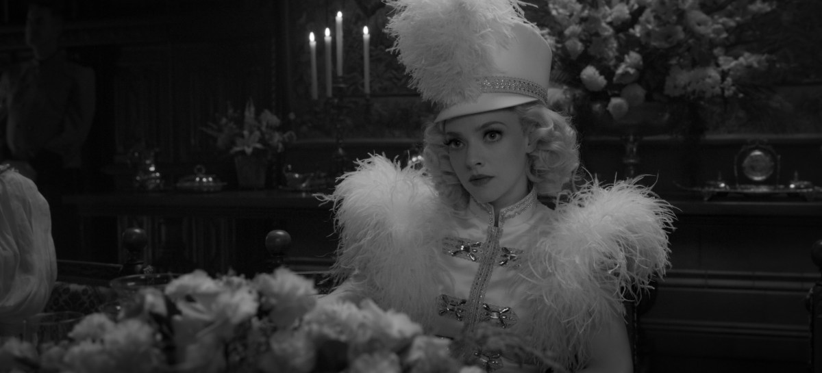
Anheuser-Busch – Let’s Grab a Beer (Super Bowl LV) (“90)
Anheuser-Busch – Let’s Grab a Beer (Super Bowl LV) (“60)
Tagline
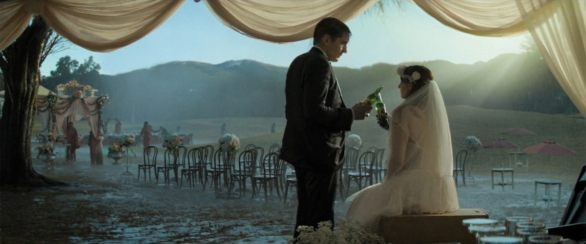
“It’s never just about the beer. It’s about being together.”
CREDITS
Client
Anheuser-Busch
Product
Beer
Title
Let’s Grab a Beer
Agency
Wieden+Kennedy Portland
Global Chief Creative Officer
Karl Lieberman
Global Chief Operating Officer
Neal Arthur
Director of Strategic Planning
Dan Hill
Creative Director
Michael Hagos
Copywriter
Brad Phifer
Head of Integrated Production
Nick Setounski
Executive Producer
Jessica Griffeth
Senior Producer
Bianca Cochran
Group Account Director
Brooke Stites
Account Supervisor
Meredith Zambito
Group Strategy Director
Stephane Missier
Strategist
Matt Hisamoto
Social Strategist
Irsis Cabral
Comms Director
Zack Green
Business Affairs
Daniella Vargas
Traffic Coordinator
Tina Wyatt
Production Company
RESET
Executive Producer
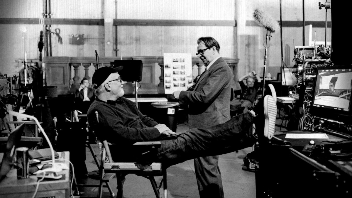
David Fincher
Managing Director/Executive Producer
Dave Morrison
Executive Producer
Deannie O’Neil
Producer
Vincent Landay
Assistant Producer
Grace Campos
Director
Adam Hashemi
1sr Assistant Director
Bob Wagner
Directors of Photography
Eigil Bryld, Chayse Irvin
Production Designer
Donald Graham Burt
Costumes
J.R. Hawbaker
Sound
Ren Klyce
Music
Barking Owl
Composer
Atticus Ross
Musical Creative Director
Kelly Bayett
Editorial & Finishing
Exile
Editor
Kirk Baxter
Additional Editor
Grant Surmi
Assistant Editor
Christopher Fetsch
Flame Artist
Dino Tsaousis
Flame Assistant
Adam Greenberg
Executive Producer
Sasha Hirschfeld
Post Producer
Toby Louie
The Perfect Storm That Led to Anheuser-Busch’s Super Bowl Ad
Inside the journey to W+K’s ‘Let’s Grab a Beer’
Tim Nudd
February 15, 2021
Muse by Clio
“Let’s Grab A Beer” Grabs 1st Place In Top Ten Tracks Chart
Atticus Ross and Ren Klyce continue to collaborate with David Fincher–this time on a Super Bowl spot directed by Adam Hashemi.
April 2, 2021
Shoot